Welcome back to the second part of my journey in building a personal website. In the first installment, we explored the initial inspirations and academic experiences that led me to this project. Now, let us delve into the practical aspects of website building, from choosing a hosting service to navigating the complexities of WordPress and plugins.
Navigating the Maze of Website Building
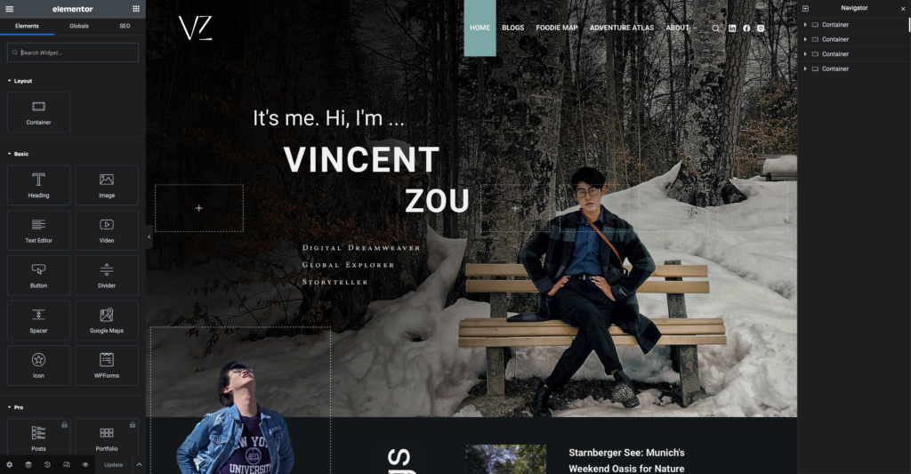 With the urgent need to aid my job hunt, I adopted a fast-track approach: building while learning. After comparing various hosting plans, purchasing my domain, and extensive research, I chose my current hosting service. It was enlightening to discover the multitude of factors one must consider: the fees associated with hosting, domain protection, and the availability of free backup plans, among others.
Concurrently, I sketched layouts and sitemaps of my website on my iPad. This exercise helped me solidify my ideas and provided a tangible blueprint for the project. Given that my website was to be built on the WordPress platform, I turned to YouTube tutorials to guide me through the process.
Initially, I felt overwhelmed by the theme and plugin options on WordPress. I was uncertain which theme kit would align with my style and the vision I had for my website. Furthermore, there are millions of site builders on WordPress, and none of them are able to communicate with each other. For instance, if one starts with the default WordPress builder and then switches to Elementor, a site building plugin, all changes made in the former one would be rendered invisible.
I selected a template for my home page since it appeared attractive, and I began customizing it. Two days later, I was satisfied with the homepage and wanted to extend the theme to other pages and unify the headers, footers, and theme. However, I realized the template was designed for single-page use and lost my work when reapplying it. Although I requested a recovery from my hosting service, the delay was too long. I decided to start from scratch.
This time I carefully compared tutorials and chose Ferdy’s four hour YouTube Tutorial. Despite its length, the tutorial was comprehensive and saved me from spending an entire week on trial and error.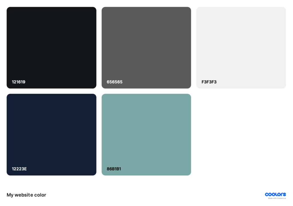
The tutorial began with the basics – menu, header, and footer – emphasizing the importance of having a concrete plan, including a sitemap and color scheme. My personal preference for green and blue, combined with a touch of elegance, guided my design choices. To achieve this, I blended these colors with off-black and off-white to reduce visual discomfort from high contrast. Sticking to only these colors created cohesion across my site.With some experience, recreating my home page was not too difficult. Web design’s inflexibility means carefully planning block placement in Elementor to put items where desired.
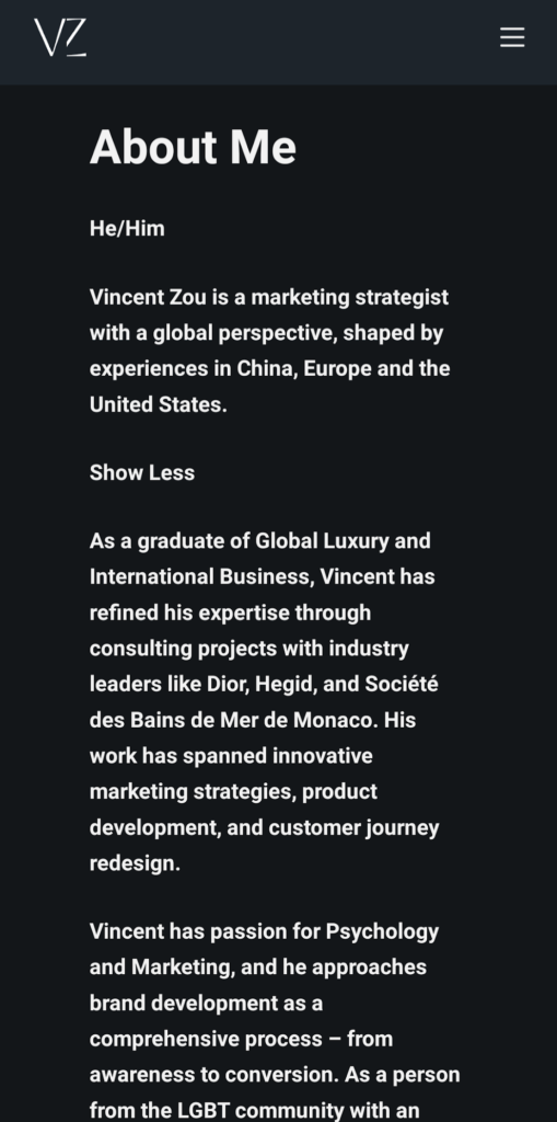
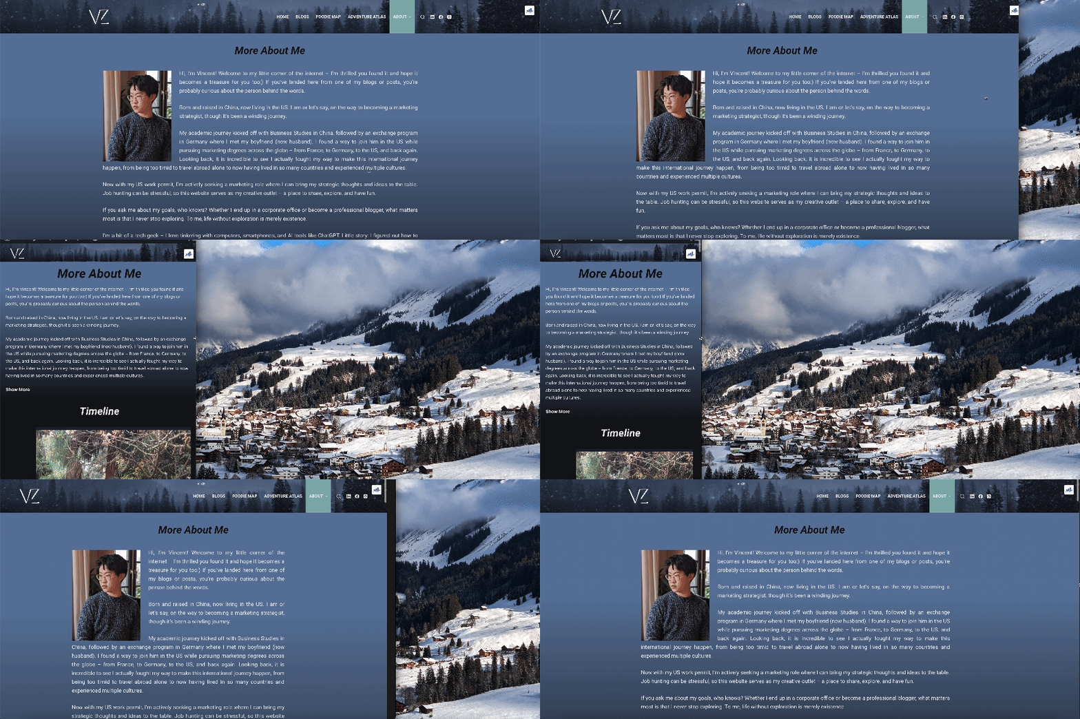
 From my digital marketing course at NCSU, I knew the significance of optimizing websites for mobile devices. Although the concept was straightforward, the implementation required considerable adjustments to accommodate smaller screens. For instance, the background images that worked well on desktops were removed to enhance readability on mobile devices.
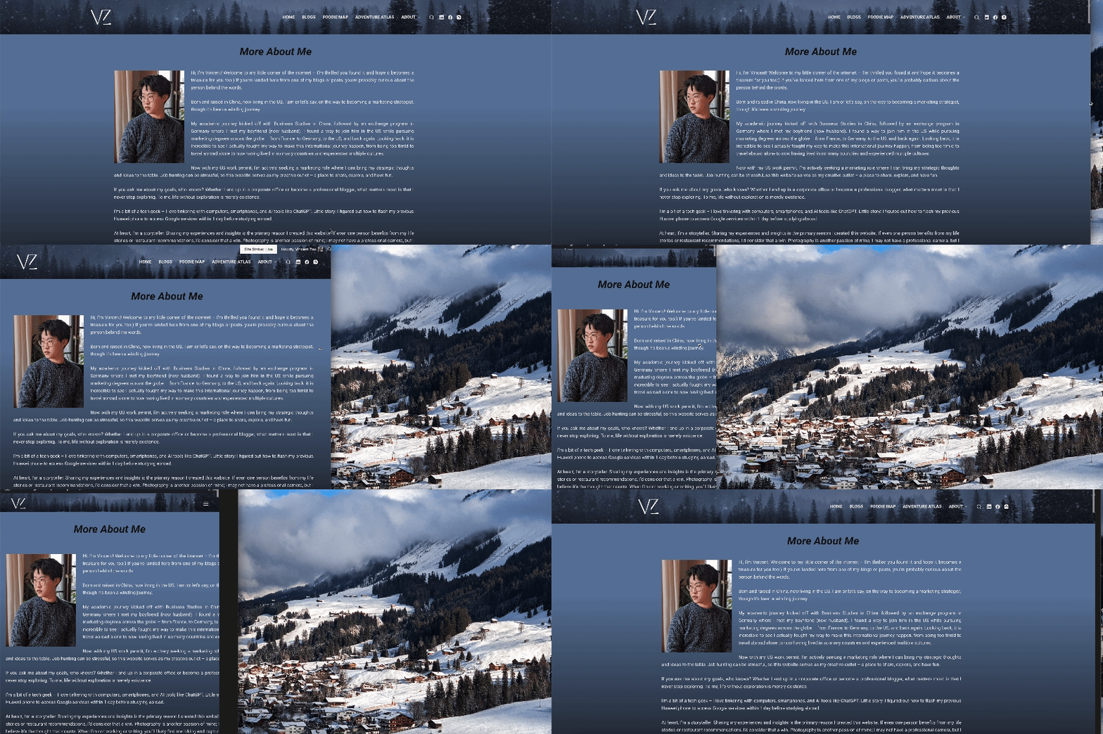
After building two pages, I realized I had not accounted for other device display sizes and zoom levels. Content shifted around on different screens. Research revealed that using absolute positioning could disrupt the layout when the screen size changed. To resolve this, I switched to using relative units like “em” and “rem” for better responsiveness. To validate the design, I previewed my website on different browsers, zooming in and out and resizing the window. If the content maintained its readability, I considered it well-designed.
Harnessing the Power of Plugins
Countless plugins extend WordPress’s capabilities, if utilized strategically. One plugin I utilized is “Read More Without Refresh,” which helps manage text display on smaller screens. By simply enclosing the text with a code in the text editor, the plugin automatically hides the excess text, improving readability. Customization options are available for those who wish to change the color scheme.
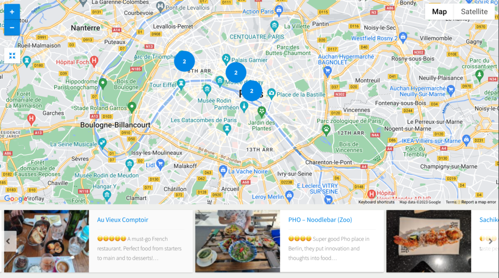 Another feature on my website is the interactive maps in the “Foodie Map” and “Adventure Atlas” sections. Contrary to initial expectations, setting up these maps was far from straightforward. Most map plugins are not free, and even after purchasing “Progress Map,” I had to obtain a Google Maps API key to activate it. Obtaining the API key required registering on Google Cloud Console and activating a billing account. Although Google provides $200 of free usage per month, which equals 28500 maploads per month, I took precautionary measures to set usage warnings and restricted the key to be used on my website only.
The “Progress Map” plugin requires each location to be a separate post with geographic coordinates. While this setup allows for a carousel display, it limits the amount of information that can be shown. To circumvent this, I customized the “More” button to link directly to Google Maps for my “Foodie Map”, providing users with additional information and reviews.
The core of my website is the “Blog” section. What captivates the audience is the quality content. I write blogs primarily about Marketing and Technology, and perhaps in the future, I will include more personal topics. I believed that if I was going to launch my website successfully, I should cover a diverse range of content across all sections. To strengthen my “Blog” section, I wanted my first blog to focus on marketing. In designing the blog catalog page, I reviewed numerous layouts from other bloggers and companies. Ultimately, I opted for a two-part layout on my page: “New Blogs,” featuring three newly posted articles, and a list catalog. For those interested, Google can provide information on how to utilize plugins for blog-related features. To maintain consistent branding and design, I chose not to use WordPress’s default post editor, instead, I used Elementor. This allowed me to incorporate the same banner and text elements that align with the overall design of my website.
I hope you found this look into the technical side of website building enlightening. In the next and final installment, we will explore the world of Search Engine Optimization (SEO). From sitemaps to snippets, I will share how I have optimized my website for both visibility and user engagement. Stay tuned!
 Do you find this article helpful or wish to discuss it further? Contact me at [email protected] or read more about me.
Journey to a Personal Website: From Inspiration to Search Engine Optimisation (2)
Welcome back to the second part of my journey in building a personal website. In the first installment, we explored the initial inspirations and academic experiences that led me to this project. Now, let us delve into the practical aspects of website building, from choosing a hosting service to navigating the complexities of WordPress and plugins.
Navigating the Maze of Website Building

With the urgent need to aid my job hunt, I adopted a fast-track approach: building while learning. After comparing various hosting plans, purchasing my domain, and extensive research, I chose my current hosting service. It was enlightening to discover the multitude of factors one must consider: the fees associated with hosting, domain protection, and the availability of free backup plans, among others.
Concurrently, I sketched layouts and sitemaps of my website on my iPad. This exercise helped me solidify my ideas and provided a tangible blueprint for the project. Given that my website was to be built on the WordPress platform, I turned to YouTube tutorials to guide me through the process.
Initially, I felt overwhelmed by the theme and plugin options on WordPress. I was uncertain which theme kit would align with my style and the vision I had for my website. Furthermore, there are millions of site builders on WordPress, and none of them are able to communicate with each other. For instance, if one starts with the default WordPress builder and then switches to Elementor, a site building plugin, all changes made in the former one would be rendered invisible.
I selected a template for my home page since it appeared attractive, and I began customizing it. Two days later, I was satisfied with the homepage and wanted to extend the theme to other pages and unify the headers, footers, and theme. However, I realized the template was designed for single-page use and lost my work when reapplying it. Although I requested a recovery from my hosting service, the delay was too long. I decided to start from scratch.
This time I carefully compared tutorials and chose Ferdy’s four hour YouTube Tutorial. Despite its length, the tutorial was comprehensive and saved me from spending an entire week on trial and error.


The tutorial began with the basics – menu, header, and footer – emphasizing the importance of having a concrete plan, including a sitemap and color scheme. My personal preference for green and blue, combined with a touch of elegance, guided my design choices. To achieve this, I blended these colors with off-black and off-white to reduce visual discomfort from high contrast. Sticking to only these colors created cohesion across my site.With some experience, recreating my home page was not too difficult. Web design’s inflexibility means carefully planning block placement in Elementor to put items where desired.

From my digital marketing course at NCSU, I knew the significance of optimizing websites for mobile devices. Although the concept was straightforward, the implementation required considerable adjustments to accommodate smaller screens. For instance, the background images that worked well on desktops were removed to enhance readability on mobile devices.
After building two pages, I realized I had not accounted for other device display sizes and zoom levels. Content shifted around on different screens. Research revealed that using absolute positioning could disrupt the layout when the screen size changed. To resolve this, I switched to using relative units like “em” and “rem” for better responsiveness. To validate the design, I previewed my website on different browsers, zooming in and out and resizing the window. If the content maintained its readability, I considered it well-designed.


Harnessing the Power of Plugins
Countless plugins extend WordPress’s capabilities, if utilized strategically. One plugin I utilized is “Read More Without Refresh,” which helps manage text display on smaller screens. By simply enclosing the text with a code in the text editor, the plugin automatically hides the excess text, improving readability. Customization options are available for those who wish to change the color scheme.

Another feature on my website is the interactive maps in the “Foodie Map” and “Adventure Atlas” sections. Contrary to initial expectations, setting up these maps was far from straightforward. Most map plugins are not free, and even after purchasing “Progress Map,” I had to obtain a Google Maps API key to activate it. Obtaining the API key required registering on Google Cloud Console and activating a billing account. Although Google provides $200 of free usage per month, which equals 28500 maploads per month, I took precautionary measures to set usage warnings and restricted the key to be used on my website only.
The “Progress Map” plugin requires each location to be a separate post with geographic coordinates. While this setup allows for a carousel display, it limits the amount of information that can be shown. To circumvent this, I customized the “More” button to link directly to Google Maps for my “Foodie Map”, providing users with additional information and reviews.
The core of my website is the “Blog” section. What captivates the audience is the quality content. I write blogs primarily about Marketing and Technology, and perhaps in the future, I will include more personal topics. I believed that if I was going to launch my website successfully, I should cover a diverse range of content across all sections. To strengthen my “Blog” section, I wanted my first blog to focus on marketing. In designing the blog catalog page, I reviewed numerous layouts from other bloggers and companies. Ultimately, I opted for a two-part layout on my page: “New Blogs,” featuring three newly posted articles, and a list catalog. For those interested, Google can provide information on how to utilize plugins for blog-related features. To maintain consistent branding and design, I chose not to use WordPress’s default post editor, instead, I used Elementor. This allowed me to incorporate the same banner and text elements that align with the overall design of my website.
I hope you found this look into the technical side of website building enlightening. In the next and final installment, we will explore the world of Search Engine Optimization (SEO). From sitemaps to snippets, I will share how I have optimized my website for both visibility and user engagement. Stay tuned!
![]() Do you find this article helpful or wish to discuss it further? Contact me at [email protected] or read more about me.
Do you find this article helpful or wish to discuss it further? Contact me at [email protected] or read more about me.